how to design streamer merch
How to Design Streamer Merch That Actually Looks Pro
Learn how to design streamer merch that looks professional and your community will love to wear. A step-by-step guide from initial ideas to print-ready files.
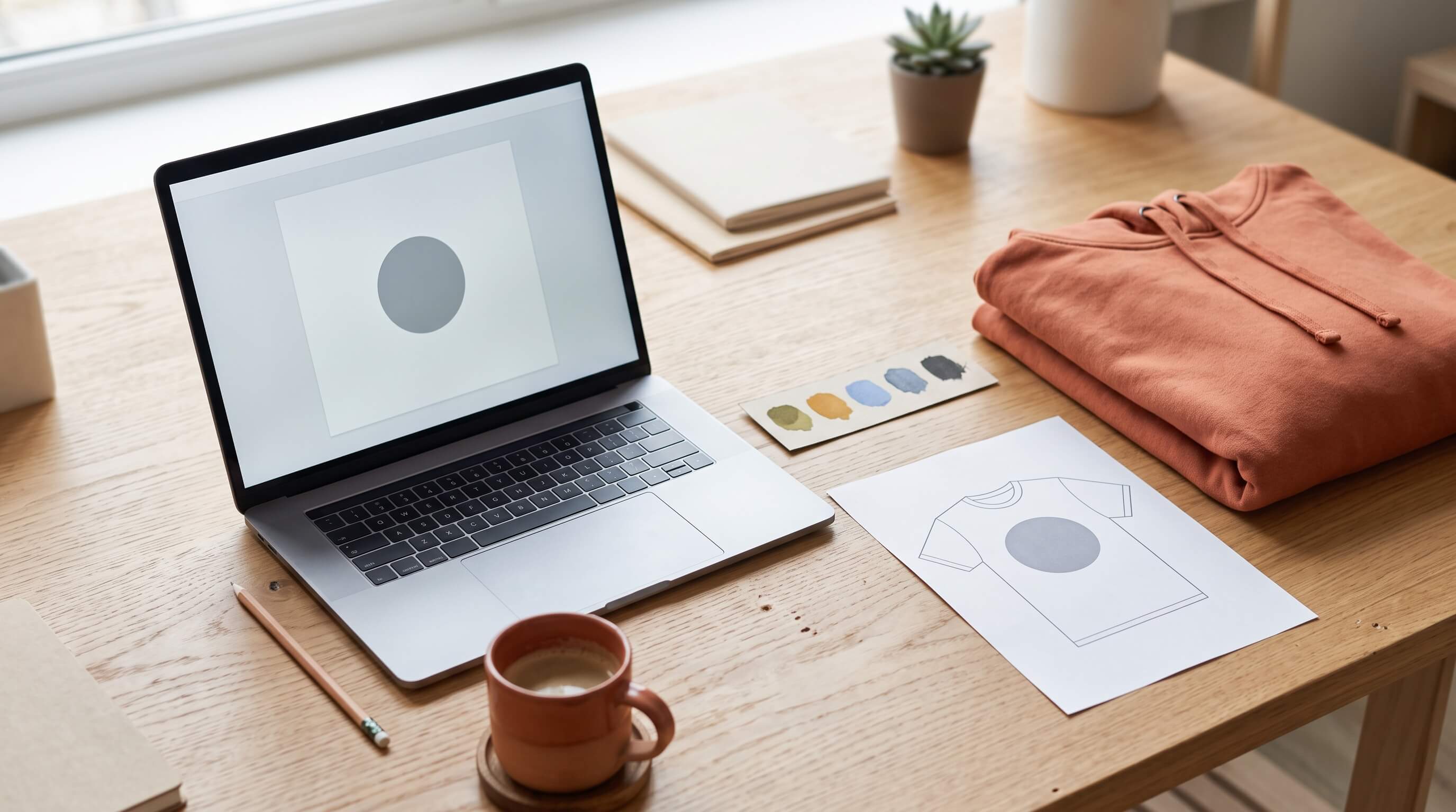
Let’s get one thing straight: you don’t need 100K followers to launch good merch. You need fifty people who would actually wear your design out in public. The biggest mistake new creators make is thinking merch is just a logo slapped on a black t-shirt. Your community deserves better than a walking advertisement.
Good merch feels like an inside joke, a badge of honor for being part of the community. It’s something people are proud to own because it looks cool on its own terms. I’ve been through the grind, ordered samples that looked awful, and spent way too long staring at a blank canvas. So, let me show you how to skip the pain and learn how to design streamer merch that looks and feels professional from day one. We’re going to think like designers, not just streamers.
Before You Open a Design Tool: The Merch Audit
The best ideas almost never come from staring at a blank page. They come from research. Before you even think about fonts or colors, you need to understand the visual language of your corner of the internet. This isn't about copying; it's about learning the rules of the game so you can play it better.
Think of yourself as a design scout. Your mission is to figure out what’s already working for communities like yours, and why. If you're starting from a blank page, check out these 10 streamer merch ideas fans actually buy to get the ball rolling.
Here’s your step-by-step plan.
- Pick 3–5 Streamers to Study. Don’t just pick the biggest names on the platform. Choose creators in your specific niche, people who play the same games or have a similar community vibe. Look for streamers whose merch seems to sell out or gets a lot of love from their chat. A streamer with 5,000 dedicated viewers often has more thoughtful merch than one with five million.
- Create Your Audit Document. Open a simple doc or spreadsheet. For each creator, you’re going to analyze their store and recent drops. Don't just glance at it; really study it. Take screenshots. Make notes.
- Analyze These Key Elements:
- Product Mix: What are they actually selling? Is it just tees and hoodies, or do they have hats, mugs, stickers, or joggers? Notice what seems to be a core part of their collection versus a one-time novelty item.
- Color Palette: Look for recurring colors. Most successful merch lines don’t use every color in the rainbow. They stick to a core palette of 2-4 colors that match their stream branding. Is it muted and earthy, or bright and high-energy?
- Typography: What kind of fonts are they using? Are they clean and modern, retro and pixelated, or bold and script-like? How many different fonts do you see across the whole collection? (Hint: it’s usually not many).
- Design Placement: This is a big one. Where is the main graphic? Is it a small, subtle logo on the left chest? A massive, detailed illustration on the back? Text running down a sleeve? Note the variety and what seems most common.
- Design Style: Are the designs based on inside jokes, a cool logo, an illustrated character, or just strong typography? How much of it is a direct reference to the stream versus something that just looks cool?
- The “Wearability” Factor: For each item, ask yourself: would a non-fan think this looks good? The best merch is often the most subtle. It’s a cool piece of clothing first, and a piece of streamer merch second. A simple, embroidered hat with a small icon is way more wearable IRL than a shirt with a giant face on it.
- Price Points: What are they charging for a t-shirt? A hoodie? A hat? This gives you a realistic baseline for your own pricing later on.
Once you’ve done this for a few creators, patterns will start to emerge. You’ll notice that for your niche, maybe sleeve prints are really popular, or that most successful designs use a limited, two-color palette. This isn’t a formula for you to copy. It's the data you need to start making informed design decisions for your own community.
Think Like a Designer: Building a Cohesive Merch Collection
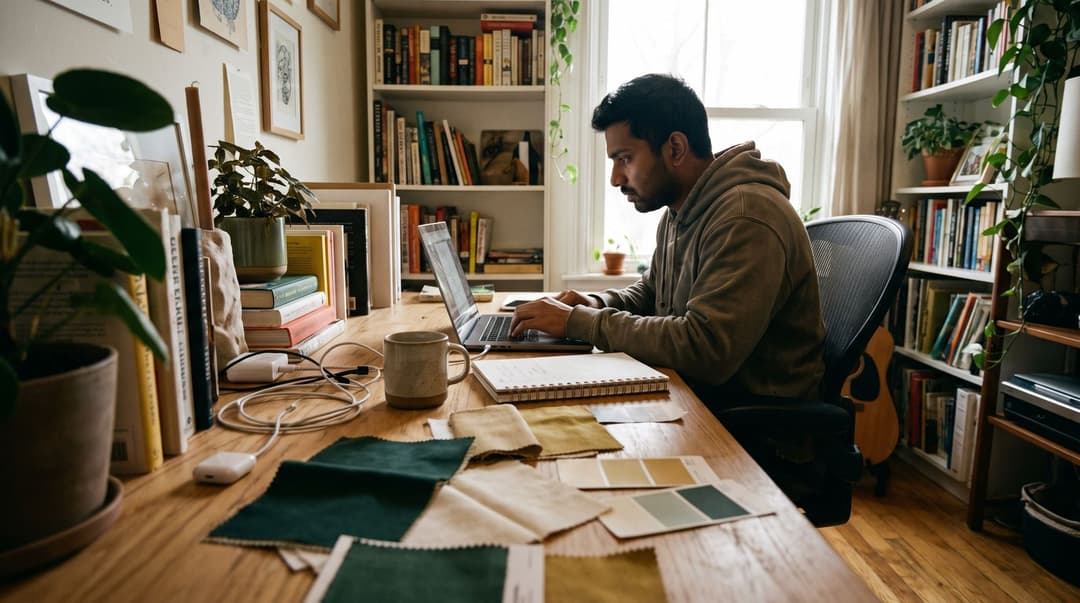
Alright, you've done your homework. Now it's time for the fun part: making your own design decisions. The single biggest leap you can make from amateur to pro-looking merch is to stop thinking about a single t-shirt and start thinking about a collection.
Even if you only launch with two items, making them feel like they belong together is key. It shows intention. It shows you care. It makes your merch feel like a legitimate brand, not just a random graphic you uploaded. The secret to this is creating a mini “design system” for your drop.
It sounds complicated, but it’s not. It’s like building a loadout in a game. You don’t just pick random weapons; you pick gear that complements each other and suits your playstyle. Your design system is your creative loadout.
Here’s how to build one:
1. Choose Your Core Colors (2-3 is plenty)
Look at your stream branding. What are your key colors? Pick two or three that will define this merch drop. This doesn't mean every shirt has to be that color, but the inks used in the prints should be consistent. For example, your system might be: off-white, a deep forest green, and a pop of gold. You can print a gold-and-white design on a green hoodie, or a green-and-white design on a black tee. The colors tie everything together. Limiting your palette makes your collection instantly recognizable and often saves money on printing.
2. Choose Your Core Typefaces (1-2 is all you need)
Typography does so much heavy lifting. You do not need five different fonts on one shirt. It’s the design equivalent of shouting. Pick one primary font for big statements (your brand name, a catchphrase) and maybe a simple, secondary font for smaller details. Make sure they complement each other. A bold, blocky font might pair well with a clean, simple sans-serif. Stick to these two fonts across the entire collection. Consistency is what makes it look professional.
3. Define Your Recurring Motifs and Logo Usage
How will you use your logo and other brand elements? Maybe you have a main logo for back prints, a simplified icon version for hats or chest prints, and a text-only version for sleeves. Decide on these variations before you start designing. This “rulebook” keeps you from just making the logo bigger or smaller at random. It ensures that a hoodie, a hat, and a sticker all feel like they came from the same family.
The All-Important “Would I Actually Wear This?” Test
This is the most important part of the entire process. Once you have a draft of a design, you have to be brutally, painfully honest with yourself. Pin it up on your wall, walk away for an hour, and come back.
Then ask the question: Would I spend my own money on this, and would I wear it to the grocery store?
If the answer is “no,” or even a hesitant “maybe,” it’s not ready. So many streamers make merch for their ego. It’s a giant print of their face or a username in a generic font. That’s not a piece of clothing; it’s a billboard.
Your community supports you because they like you. They want to feel like they’re part of the club. The best merch does this with subtlety.
- Is it based on a community joke? Perfect. A design that just says “The Goose is Loose” is meaningless to outsiders, but it’s a treasured memory for your chat. That’s powerful.
- Is it genuinely a good design? Maybe it’s a cool illustration or a really well-executed typographic layout. If it looks good, people will wear it, and it becomes a great conversation starter when someone asks, “Hey, cool shirt, what’s that from?”
- Is it just a logo? Be careful. A small, tastefully embroidered logo on the chest can look classy. A giant, screen-printed logo in the middle of a shirt can feel cheap and low-effort unless your logo is already iconic.
Be your own harshest critic here. If you wouldn't be genuinely excited to wear it, don't ask your community to.
Your Design Toolkit: The Best Tools for Every Skill Level
You do not need to be a professional artist with a decade of Adobe Illustrator experience to make great merch. Honestly, some of the best-selling merch is just really clever text. The tool you use is less important than the idea behind it. Here are a few solid options, broken down by skill level and budget.
For Total Beginners: Canva
If the thought of design software makes you sweat, start here. Canva is a browser-based tool that’s incredibly user-friendly. It’s built on templates, so you can find a layout you like and just customize the text and colors. It's free, fast, and perfect for creating simple, type-heavy designs that look clean and professional. You won’t be doing complex illustrations here, but for your first drop, a strong typographic design is often better anyway.
If you want to see it in action, there are tons of tutorials out there. Watching someone go through the process, like in this video on How to Design a T-Shirt in Canva, can be super helpful to see how the interface works and how to get your files ready for a printer.
For Those Who Want More Style: Kittl
Kittl is like Canva’s cooler older sibling. It’s also template-based and runs in your browser, but it specializes in the kind of stylized, vintage, and intricate typography that’s popular for apparel. You can easily curve text, add textures, and use a huge library of graphic elements. It has a fantastic free tier and even has a feature to automatically vectorize your design, which is a huge plus for keeping things crisp. It also includes built-in mockup generators, so you can see your design on a shirt or hoodie right away.
For Access to Pro Fonts for Free: Adobe Express
This is Adobe’s answer to Canva, and it’s a seriously powerful free tool. Its biggest advantage is that it gives you free access to the incredible Adobe Fonts library. If you’re a typography nerd, this is a huge deal. You get thousands of professional, high-quality fonts to use in your designs at no cost. The interface is clean and simple, making it another great choice for beginners who want to step up their font game.
For Maximum Control: Adobe Illustrator or Figma
If you’re a designer, have design experience, or are hiring a professional, this is the territory you’ll be in. Illustrator is the industry standard for vector graphics, meaning anything you create can be scaled to the size of a billboard with no loss in quality. It gives you total control over every single point and line. Figma is a powerful (and free for individuals) alternative that is also vector-based. If you plan on making merch a serious part of your brand, learning one of these or working with someone who knows them is a great long-term investment. This is where you’d create the official “master file” for your logo.
The Nitty-Gritty: Prepping Pro-Level, Print-Ready Files
This is the part that feels boring, but I promise you, it's the part that separates the pros from the people who get an angry email from their printer. A brilliant design idea can be completely ruined by a poorly prepared file. You could end up with a blurry, pixelated mess that looks nothing like it did on your screen. Getting your print-ready artwork right is the difference between a crisp, professional-looking print and a blurry, amateur mess; Printful's print-file guide lists the exact specs printers expect.
Here is your technical checklist. Save it, bookmark it, and check it before you upload any file.
- Design at the Right Size. Don't design in a small 500x500 pixel square and then try to stretch it. It will look awful. Most print-on-demand services have templates, but a good rule of thumb for a standard t-shirt print is to work on a canvas that is at least 4500 pixels wide by 5400 pixels tall.
- Use High Resolution (300 DPI). DPI stands for “dots per inch.” It’s a measure of print quality. Your screen shows things at 72 DPI, but for printing, you need 300 DPI. When you create your new file in your design program, this is one of the first settings you’ll choose. A 300 DPI file has more data, which means a sharper print.
- Export as a Transparent PNG. For most direct-to-garment printing, you’ll want to upload a PNG file with a transparent background. This means the printer will only print your design, not a giant white or black box around it. Make sure you check that “transparent background” box when you export.
- Keep a Vector Master File. If your design includes a logo or text, you should always have a vector version of it (saved as an .SVG, .AI, or .EPS file). This is your master file. You can give this to any designer or printer, and they can resize it for anything from a tiny pin to a giant banner without it ever getting blurry.
- Check Your Contrast. A dark grey design might look cool on a black shirt mockup on your bright screen. But in real life, it will be practically invisible. Make sure your design has enough contrast with the garment color to be clearly visible from a distance.
- Simplify for Embroidery. Embroidery can’t handle super fine lines, tiny text, or subtle gradients. It will just turn into a messy thread-blob. If you’re designing for a hat or a patch, think in bold shapes, clean lines, and simple color blocks.
The Most Important Step: Order a Physical Sample
I cannot stress this enough. You must order a sample before you launch. Mockups lie. They can’t tell you if the t-shirt fabric is scratchy, if the fit is weird, if the printed color is totally different from what you saw on screen, or if the design starts cracking after one wash.
I once designed a shirt with what I thought was a cool, subtle grey text on a charcoal shirt. The mockup looked great. When the sample arrived, the text was completely unreadable. It was a total waste. I was just glad I was the one who wasted $30 on a sample, not that one of my supporters wasted $30 on a bad product.
Wear your sample. Wash it. Wear it on stream. See how the print sits on your body and how it looks on camera. This is the ultimate quality control, and it’s the most respectful thing you can do for the people willing to spend their money to support you. Using a print-on-demand service is a perfect, low-risk way to order a single item for testing without having to buy a box of 50.
The Pro Merch Design Checklist: Dos and Don'ts
Here’s a quick cheat sheet to reference before you finalize a design. It’s an easy way to check your work and avoid common mistakes.
DO:
- Do use subtle references. Lean into the inside jokes and phrases that make your community special. People love being in on the secret.
- Do focus on strong typography. A great font with a clever phrase is often more effective and timeless than a complicated illustration.
- Do use negative space. Don’t feel the need to fill every inch of the printable area. Letting your design breathe makes it look more confident and professional.
- Do check readability from a distance. Your design should be understandable from at least a few feet away. If someone has to squint to read it, it’s too complicated.
- Do create a cohesive collection. Use a consistent color palette and set of fonts to make your products look like they belong together.
DON'T:
- Don't stretch a low-resolution image. If you want to use an emote, you need the original high-resolution file. Stretching a 112x112 pixel emote to fit on a shirt will result in a blurry, pixelated disaster.
- Don't use five different fonts. It makes your design look chaotic and amateurish. Stick to one or two that work well together.
- Don't just oversize your logo on everything. A big logo can work on a hoodie's back, but consider a smaller, embroidered version for a hat or a subtle icon for a t-shirt chest.
- Don't copy another creator's identity. It's fine to be inspired by their color choices or product mix, but your designs need to be uniquely yours.
- Don't assume one design fits all. A design made for a t-shirt probably needs to be rearranged or simplified to work well on a coffee mug or a phone case.
Keeping it Legal: A Quick Guide to Art & Font Licensing
This is the final, crucial check that can save you from a massive legal and financial headache down the road. Just because you can download something from the internet doesn’t mean you can legally print it on a shirt and sell it. You need to have the commercial rights for every single element in your design.
Here’s a quick breakdown:
- Commissioned Art: If you hire an artist, you need a contract that explicitly states you have the rights to use the art for commercial purposes (i.e., on merchandise). Don’t assume it’s included. Get it in writing.
- Fonts: Many “free” fonts are only free for personal use. To use a font on merch you sell, you need a commercial license. Use reputable sources like Adobe Fonts or Google Fonts (most of which are open source), or purchase a license from a font foundry.
- Stock Assets & Graphics: If you use a graphic from a stock photo site, make sure your license covers use on physical merchandise. The standard license often doesn't.
- Game Imagery: This is almost always a hard no. You cannot take a screenshot from a game or use a game’s logo and sell it without explicit written permission from the game developer, which is incredibly rare.
- AI-Generated Art: Be very careful here. The legal landscape for AI art is still evolving, and copyright ownership is often unclear. Using it for commercial merch is a risk.
My advice? Keep a folder with the license agreements and artist contracts for every design you sell. It’s a little bit of boring admin work that can save your entire business if a question ever comes up.
It’s All About a Thoughtful Process
Creating professional-looking streamer merch isn't about being a world-class illustrator. It’s about being thoughtful. It’s about putting in the effort to create something your community will be genuinely excited to own.
So, do your homework. Build a simple but consistent design system. Choose the right tool for your skill level and get your technical files right. And most importantly, create something that you yourself would be proud to wear. Your merch is more than just a product; it’s a physical connection to the community you’ve built. Treat it with the respect it deserves, and your chat will love you for it.
FAQ
Do I need to be an artist to design good merch?
No, focusing on strong typography, simple icons, and community in-jokes is often more effective than complex illustrations. Good design is about good decisions, not just drawing skills.
How much should I pay for a merch design?
It varies wildly, from $50 on a freelance site for simple text to hundreds or thousands for a full collection from a pro designer. Start with what you can afford and reinvest as you grow.
Can I just put my emotes on a shirt?
You can, but make sure the original file is high-resolution enough to print cleanly. It works best for simple, bold emotes and is often better as part of a larger design than just by itself.
What's the difference between vector and raster art?
Simple answer: vector art (like a logo file, often ending in .AI or .SVG) can be scaled to any size without losing quality. Raster art (like a .JPG or .PNG) is made of pixels and will get blurry if you stretch it too much.
Keep reading
- 10 Streamer Merch Ideas and Design Concepts Fans Actually Buy
Explore 10 streamer merch ideas fans actually buy, from mascots and inside jokes to limited drops and desk setups, plus tips on bringing designs to life.
- How to Design Merch Fans Actually Want to Wear
Learn how to design merch your fans will actually wear. Get merch design ideas, practical tips, and a step-by-step guide for your first drop.
- Esports Merch: A Guide to What Fans Actually Buy
Trying to figure out what esports merch your fans will actually buy? We break down the essential items, the psychology behind fan purchases, and how to launch your first drop without risk.