streamer logo maker
The Streamer Logo Checklist
A streamer logo maker won't save a bad design. Learn the 4 tests your logo must pass, scalability, color, embroidery, and file format, before you print.
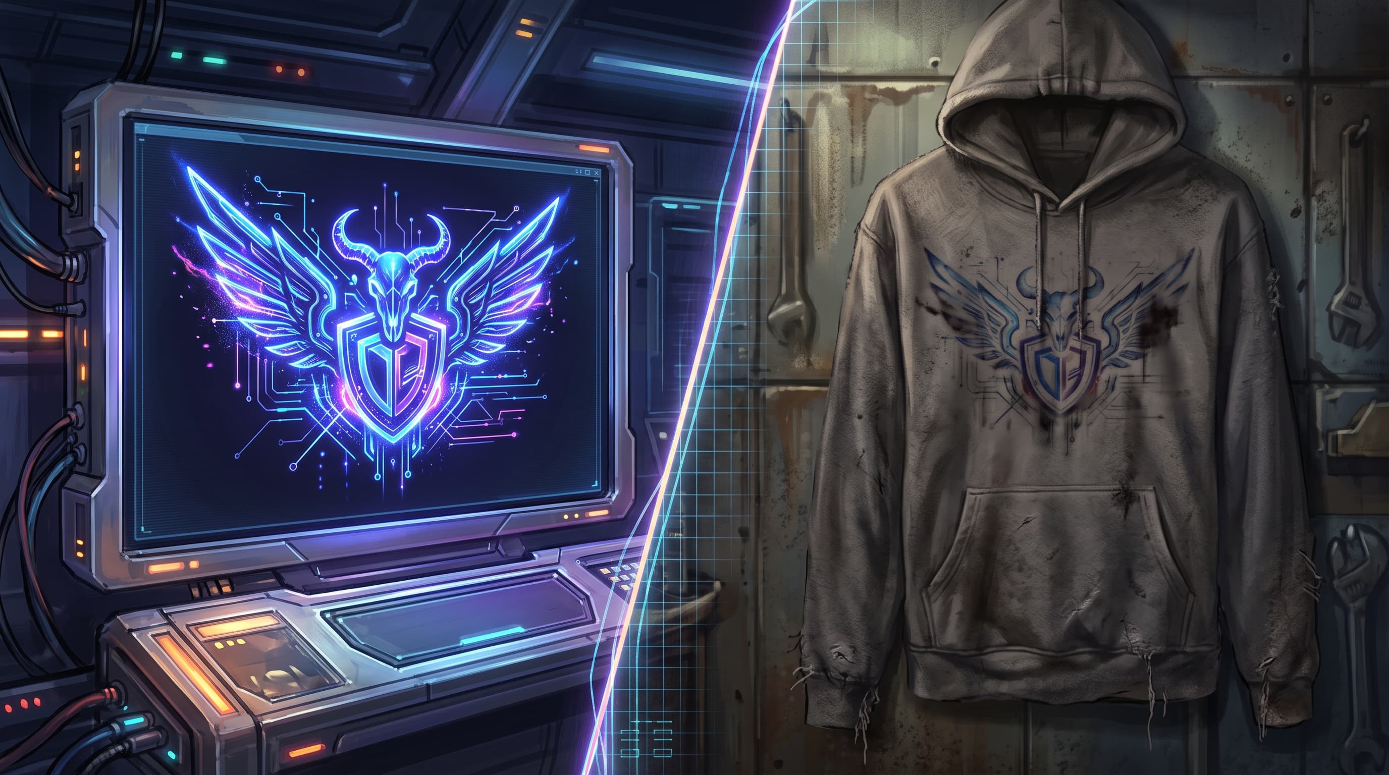
Let me guess: you fired up a streamer logo maker, spent three hours cooking up something with a glowing skull, five gradient layers, and a font so wispy it looks hand-drawn. On your profile pic? Absolute fire. Then you slapped it on a hoodie mockup and... it turned into a muddy blob nobody could read from more than two feet away.
Yeah. Been there. My first merch drop was a beautiful digital logo that printed like garbage, and I ate the reorder cost to prove it.
If you are a creator streaming on Twitch or YouTube with a dedicated community of 1,000 to 50,000 followers, launching your first merch line is a major milestone. But too many creators think merch is a game reserved only for massive, top-tier streamers. It isn't. You can absolutely launch a highly successful merch drop with a small, passionate chat. The secret isn't a massive budget; it's a smart, clean design.
Here's the thing nobody tells you: a logo built for a digital profile picture follows completely different rules than one built for physical merch. A screen glows and packs in pixels. A t-shirt doesn't. A hat gets stitched with thread. A mug gets baked.
So before you commit to anything your chat has to pay real money for, run your design through this simple four-test checklist. No design degree required.
The Scalability Test
Your logo has one job across a hundred sizes: stay instantly recognizable. It needs to read the same whether it's a tiny browser favicon, a stitched emblem on the side of a hat, or a giant full-front print on a hoodie.
If your stream logo only looks good at exactly one size, it's not a logo yet, it's an illustration. Many popular logo ideas fall flat because they are too intricate. They look spectacular when they take up the whole screen, but as soon as they are scaled down to fit on a custom hat or a mug sleeve, they become unreadable.
The "Squint Test"
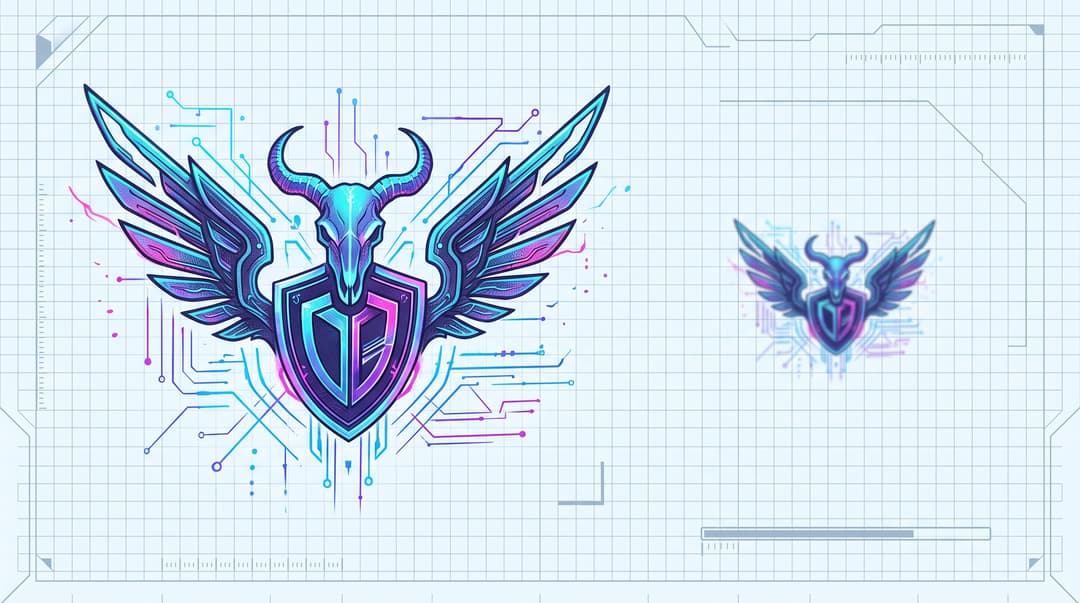
This one is free and takes five seconds. Pull up your twitch logo, zoom way out until it is thumbnail-sized, and then literally squint your eyes at it.
Does the core shape survive? Can you still tell what it is? Or does the whole thing collapse into a gray smudge?
If the main idea gets lost when you squint, your design is too complicated. Great logo ideas hold their shape when you strip away the detail. Think about how simple the most memorable game logos are, you can doodle the Fortnite llama or the Apex Legends diamond from memory. That is the bar.
The Icon vs. the Full Logo
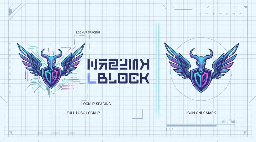
Here's a move most new creators skip: build a simplified, icon-only version alongside your full logo.
Your full logo, with your name spelled out, is perfect for a big chest print. But it is useless on a hat's left-chest embroidery or a sleeve print, where you have maybe two inches to work with. That is what the icon is for.
Design both versions from day one. The full lockup for big spaces, the stripped-down mark for tiny ones. This single habit saves you from cramming an unreadable full logo onto a beanie.
See It Before You Commit
Squinting is a decent gut check, but the ultimate test is visualization, seeing your logo in a real-world context at real sizes. The absolute best way to know if your logo passes is to see it with your own eyes on actual products.
Before you spend a dime, use a mockup generator to test it on a few different items like a t-shirt, a hat, and a mug. All mockups for Printful products are totally free, and you can create beautiful product mockups for free. They even have an embroidery mockup generator that gives a realistic preview of how your design will look stitched onto items like t-shirts and hats. Seeing your logo on a real hoodie preview will tell you in about ten seconds whether it works.
Scalability Pass/Fail Criterion:
Zoom your logo down to 50x50 pixels. If you cannot instantly identify the brand or icon, the design fails the scalability test and needs simplification.
Test #2: The Color & Cost Check
Time for the test that saves you actual money. Simple rule: the more colors in your logo, the more expensive and complicated your merch gets. Smart color choices early on are the difference between a profitable first drop and one where you barely break even.
Screen Colors vs. Ink Colors (RGB vs. CMYK)
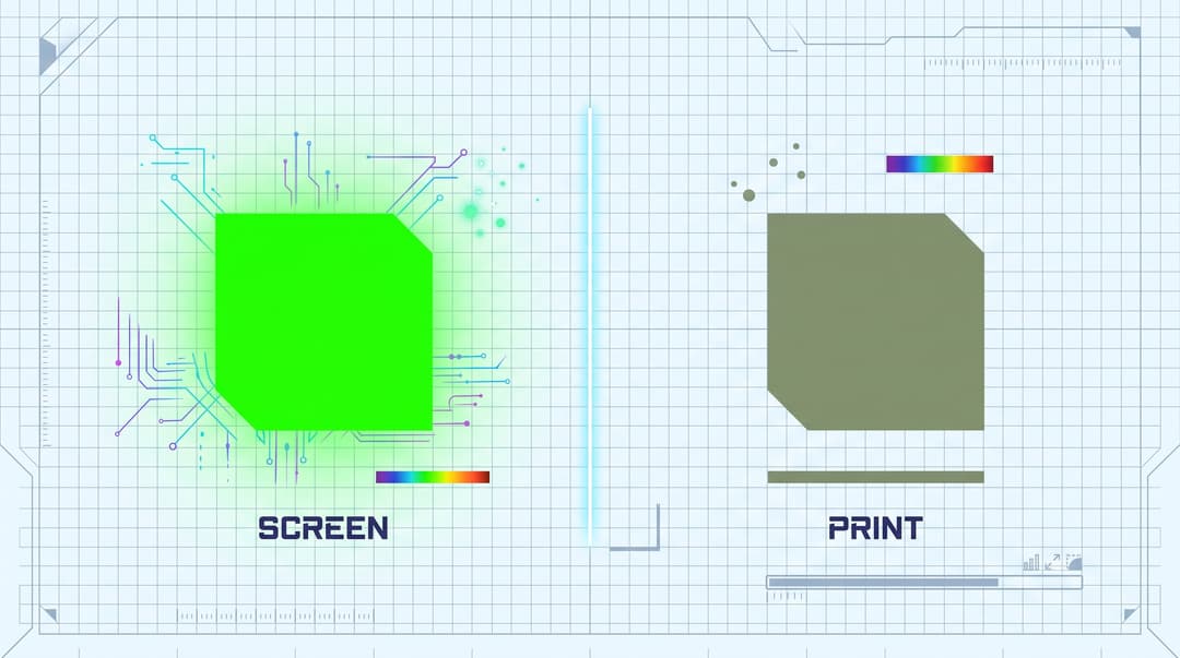
Your monitor makes color with light, which is RGB. Printers make color with ink, which is CMYK. They are not the same system, and they do not fully overlap.
That eye-searing neon green that pops on your overlay? It physically cannot be reproduced with standard inks, so it will come out muddy and dull on fabric. Same goes for electric blues and hot pinks.
Design your merch colors assuming they will shift. Pick shades that translate well to ink, and preview them in a mockup before you order.
Why Color Count Hits Your Wallet
This is the part that surprised me most when I started. If you choose traditional screen printing for bulk orders, every single color is a separate screen the shop has to build.
According to Arklavo's custom apparel guide, print shops typically charge a setup fee for every color screen used. If your logo has five or six colors, your upfront costs can quickly wipe out your profit margins, especially on a small run of 24 or 50 shirts. Even if you use a print on demand model where digital printers handle unlimited colors, keeping your design down to 1 or 2 clean colors makes it vastly easier to scale up to bulk orders later on. Industry pros recommend keeping things simple to avoid skyrocketing print costs.
For a first merch drop, a clean 1- or 2-color design is almost always the smart play. More margin, fewer headaches.
Always Have a Single-Color Version
Non-negotiable checklist item: build a version of your logo in pure black on transparent, and pure white on transparent. No gradients, no shading, just one solid color.
Tons of products and printing methods (embroidery, one-color prints, dark garments) demand a single-color file. If you cannot make your logo work in flat black, that is a red flag your design leans too hard on color to be recognizable. Fix it now.
Color Pass/Fail Criterion:
Convert your design to grayscale, then to pure black and white. If the visual impact of your logo is lost without its color palette, it fails the color check.
Test #3: The Detail & Embroidery Check
Embroidery is where pretty digital logos go to die. An embroidery machine isn't a printer, it stitches thread through fabric. Every tiny detail, thin line, and smooth gradient that looks crisp on your screen turns into an unrecognizable lump of thread when a needle tries to reproduce it.
If you plan to put your logo on hats, beanies, or embroidered hoodies, it has to pass this test.
Picture the Difference
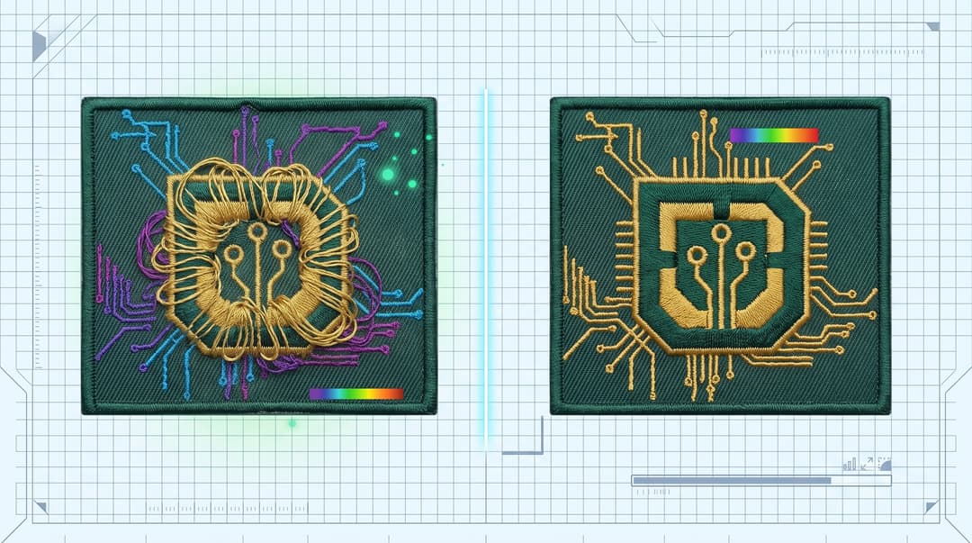
Look at these two versions of the same circuit-chip logo. One is a tangled mess: the gold thread balls up into a dense knot at the center, and the circuit lines fray out in every direction with no clear structure. The other is crisp and controlled: the same gold thread traces a tight, well-defined shield shape, and every circuit line lands exactly where it should.
The first one? A machine cannot stitch a design that's too dense or too loosely defined, it just clumps the thread into a knot. The second stitches clean every time, because the artwork gives the needle clear paths to follow. Simple wins in thread, every single time.
The Rules for Embroidery-Friendly Logos
Keep these three rules in your back pocket:
- No thin, wispy lines. If a line is too skinny, the machine cannot lay thread down cleanly. Beef everything up to at least 2mm thickness.
- No color gradients. Thread comes in solid colors. Fades do not exist, they just look like a mistake when stitched.
- Bold, clean fonts only. Skip the delicate script and hair-thin typefaces.
The Typography Trick
Your typography needs to be thick enough for a needle to go in and out without shredding the letters apart. Thin fonts literally fall apart in thread.
Here's a fast test: type out your logo text, then add a 1-pixel stroke or outline around each letter. If the letters start touching or merging into each other, your font is too tight and too thin for embroidery. Swap it for something chunkier.
Whether you built your mark by hand or leaned on a gaming logo maker with pre-made templates, run this exact check before you approve anything for stitching.
Embroidery Pass/Fail Criterion:
Apply a 1-pixel stroke to your text and reduce the entire design to 2 inches wide. If letters bleed together or details drop below 1mm in width, the design fails the embroidery check
Test #4: The File Format Check
This is the most overlooked step, and getting it wrong is what forced my first reorder. Whatever files your designer or logo maker hands you determines whether your merch is even possible. A PNG or JPG is for your stream, it is not what your printer needs.
Vector vs. Raster, Explained Like You Game
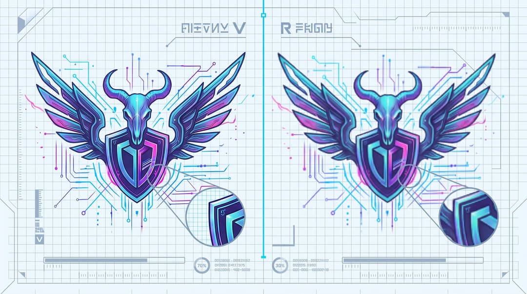
Think of it like this. A vector file is a recipe. It is a set of math instructions, so you can scale it to any size, from a sticker to a billboard, and it stays perfectly sharp. That is what printers want.
A raster file (your PNG or JPG) is the baked cake. It is already done, locked to a fixed pixel size. Try to make it bigger and it gets blurry and pixelated, like stretching a low-res screenshot. You cannot un-bake a cake back into a recipe.
That is why "just send me the PNG" doesn't cut it for a full-front hoodie print. The printer needs the recipe so they can size it to the garment cleanly.
The Essential File Checklist
Here are the exact files every streamer needs on hand for their logo. Save these somewhere safe:
| File Type | Format | What It's For |
|---|---|---|
| Vector | AI, EPS, or SVG | All printing — shirts, hoodies, hats, stickers. Scales to any size. |
| High-res PNG | PNG with transparent background | Digital use — panels, listings, wherever you need it on-screen. |
| Single-color vector | SVG or EPS (black + white) | Embroidery, one-color prints, dark garments. |
If you're hiring a designer, put "I need a vector file (AI, EPS, or SVG)" in writing before you pay. If you're using a logo tool, check that it lets you export SVG. This one line saves you the "wait, you can't use this?" conversation later.
Format Pass/Fail Criterion:
Double-click your main logo file. If the file extension is .jpg or .png and you cannot scale it up 500% without seeing pixelation, it fails the print-ready format check.
Okay, Where Do I Actually Make a Logo Like This?
You know the rules now, so here's a quick rundown of where to actually build the thing. Keep the checklist open the whole time.
Option 1: Free Streamer Logo Makers (For Tight Budgets)
If you are starting out with zero budget, a free streamer logo maker like Canva or Fotor is a totally fine place to begin. Just play to their strengths: stick to simple shapes, bold fonts, and one or two colors, which is exactly what passes the tests above. The key move is checking whether they let you export an SVG so you actually own a print-ready vector, not just a PNG.
Option 2: Template-Based Gaming Logo Makers (The Middle Ground)
If you want something with more polish, template-based tools are a solid option. A twitch streamer logo maker platform like Placeit, or a gaming logo maker like Own3d, gives you professionally designed templates you can customize. Big catch, though: run your chosen template through this exact checklist before you commit. Plenty of flashy templates fail the squint test or lean on gradients that won't survive embroidery. The template being pretty doesn't mean it is merch-ready.
Option 3: Hiring a Professional Designer (The Premium Route)
If you have a little budget, hiring a designer on a freelance platform is always an option. This checklist is the exact design brief you should hand them. Ask for scalability, smart color limits, embroidery-safe details, and proper vector files. You will get back an asset that works everywhere.
Whichever route you pick, the tool matters way less than the four design principles. A cheap logo that passes all four tests beats an expensive one that fails them.
Final Checklist: Getting the Most Out of Your Streamer Logo Maker
So there's your whole checklist. Before any design touches your merch, run it through the four tests:
- Scalability Test: Does it survive the squint test at tiny sizes?
- Color & Cost Check: Are you sticking to 1 or 2 flat colors to avoid high print setup fees?
- Detail & Embroidery Check: Is your typography thick enough for needles and thread?
- File Format Check: Do you have the print-ready SVG vector recipe?
Here's my honest take after doing this for a while: you don't need a huge following or a fat budget to launch great merch. You just need a smart, practical design that respects how physical products actually get made. That is the whole trick. Whether you build it in a free streamer logo maker or hire it out, the checklist remains the same.
So stop overthinking it. Start designing, run it through these four tests, throw it on a mockup to be sure, and get ready to make something your community will genuinely be proud to wear.
FAQ
What is the difference between direct-to-garment (DTG) and screen printing?
Direct-to-garment (DTG) functions like an inkjet printer, applying ink directly to the fabric. It handles complex, multi-colored designs easily and has no minimum order requirements, making it ideal for print on demand. Screen printing applies ink through physical mesh screens, resulting in highly durable, vibrant prints. Screen printing is much more cost-effective for bulk runs, but setup fees scale up with the number of colors in your design.
Can I convert a JPG or PNG into a vector file?
Yes, but automatically converting a raster image to a vector using auto-trace tools often results in messy, jagged lines that look unprofessional when printed. The best approach is to design your logo as a vector from the beginning or have a professional designer manually vectorize your existing raster image.
Why do the colors on my physical t-shirt look less vibrant than on my stream overlay?
Monitors display colors in RGB (Red, Green, Blue) using light, which supports highly vibrant, glowing neon shades. Printers use CMYK (Cyan, Magenta, Yellow, Key/Black) physical inks, which reflect light. Because the CMYK color spectrum is smaller, neon colors and ultra-bright shades naturally appear darker or more muted when printed on fabric.
What is "digitizing" in embroidery?
Digitizing is the process of converting a digital graphic file into a specialized stitch file that an embroidery machine can read. The digitizer maps out where every individual stitch goes, the stitch direction, and the thread color shifts. If your logo has too many fine details, it cannot be digitized cleanly.
Should I use my main stream logo or a unique design for my merch?
While using your primary channel logo builds brand recognition, creating a simplified, stylized version or an illustrative concept themed around an inside joke from your chat often performs better. Viewers love wearing subtle designs that look like stylish streetwear while still serving as a nod to your community.
Keep reading
- The Streamer Merch Launch Checklist: From Idea to Sale
Your complete streamer merch launch checklist is here. Follow these 15 steps from design and store setup to your first sale, with no fluff and no gatekeeping.
- Custom Desk Mats for Streamer Merch: The Full Guide
Thinking about a custom desk mat for your streamer merch? This is the complete guide to design, finding a printer, and setting a price your community will love.
- Podcast Merch Ideas That Aren't Just Your Logo
Looking for podcast merch ideas that aren't just a boring logo? We'll show you how to find inside jokes and community moments to create merch your listeners will love.